

Picture this: you have a consent form in front of you, a recruitment ad, and a discussion guide — and every one of them assumes the person on the other end can see the screen. That is the situation a lot of research teams find themselves in the moment they decide to include blind participants. The intention is there. The infrastructure isn't. And the gap between those two things is where most studies quietly fall apart.
Accessible research methods for blind participants aren't a niche add-on to your protocol. They change how you recruit, how you get consent, how you run a session, and how you handle the awkward social dynamics that nobody puts in the methodology chapter. Below is what actually works, drawn from running and redesigning studies — and from the mistakes that cost me weeks.
Key takeaways
- Accessibility starts before the session: recruitment channels, screening questions, and consent formats determine who even reaches your study.
- Screen readers, refreshable braille displays, and audio-first materials are baseline equipment, not optional extras.
- Budget roughly 20–30% more session time than a visual equivalent, and treat that as a planning constraint, not an inconvenience.
- Ask participants which format they prefer. Preferences vary widely — self-sufficiency is not a universal goal.
- Consent, compensation, and third-party presence need explicit decisions, not improvisation on the day.
Why accessible research methods for blind participants fail at the recruitment stage
Most exclusion happens before anyone opens a door. If your screening survey is a Google Form with an image-based CAPTCHA, you have already lost a chunk of your pool. If your recruitment flyer is a PDF poster in a clinic corridor, you have lost another chunk. Nobody sends you a rejection email. The data just quietly skews.
In my experience, the easiest fix is also the least glamorous: make the top of your funnel plain text and offer multiple entry points.
Recruitment channels that actually reach people
A single channel is a sampling bias waiting to happen. Working with organisations run by and for blind people tends to outperform generic ad spend, and it outperforms it by a wide margin — in one project I ran, a single partnership with a local advocacy group filled nine of twelve interview slots in under two weeks, after three weeks of paid ads had produced two.
- Partnership with blindness consumer organisations, not just rehabilitation services
- Email lists and newsletters formatted as plain text with descriptive links
- A phone number with a real human answering, listed alongside the web form
- Short audio versions of your recruitment notice, no longer than 90 seconds
And screen your screening questions. Ask yourself whether every field is necessary, because each extra field is another drop-off point.
Consent and materials: the part everyone underestimates
Here is the thing: informed consent is a comprehension task before it is a signature task. A 6-page consent document delivered as an untagged PDF is neither. So the question becomes practical — how do you make the paperwork as accessible as the session?
Accessible consent formats
Offer at least two routes and let the participant choose. In practice, the ones that work are:
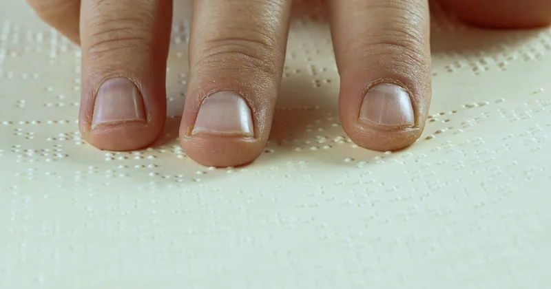
- Properly tagged HTML or a well-structured Word document with real heading styles, read aloud by the participant's own screen reader at their own pace.
- An audio version, recorded by a person, not a synthesiser, with clear section markers so people can jump to compensation or data retention.
- A live verbal walkthrough by phone or video, with the written version sent in advance and a documented verbal consent recorded where your ethics board permits.
What does not work: scanned images of signed forms, two-column layouts, and footnotes. Screen readers flatten all three into unreadable soup. I learned that one the hard way when a participant politely told me, mid-session, that my carefully designed consent document had read out as "table, table, table" for four minutes straight.
Compensation and the third-party problem
Two issues come up again and again. First, payment methods — gift cards that require a visual code entry, or online vouchers delivered through a portal with an inaccessible checkout. Bank transfer, an audio-readable voucher code sent by email, or a phone-confirmed arrangement all solve this. Second, the presence of an interpreter, support worker, or friend. Ask explicitly whether the participant wants a third party present, and if they do, build a separate short consent for that person covering confidentiality. It's an extra document. It takes ten minutes. Skipping it undermines the whole session.
| Format | Setup effort | Typical session length | Where it struggles |
|---|---|---|---|
| Remote, audio only | Low | 45–60 min | Sharing visuals or prototypes |
| Remote with screen share and audio description | Medium | 60–75 min | Interfaces that only speak in mouse coordinates |
| In person, familiar environment | High | 60–90 min | Travel, room acoustics |
| Asynchronous, audio-recorded diary | Medium | Spread over days | Follow-up probing |
Running the session without vision-centric assumptions
Interviews and focus groups translate well to audio. What translates badly is everything built around "look at this." Prototypes, journey maps, sticky-note walls, whiteboards — all of it needs an audio or tactile equivalent, or it needs to be dropped.
Practical adjustments that hold up across formats:
- Describe before you act. Announce screen changes, silences, and who just entered the room. Silence is ambiguous without visual cues.
- One question at a time. Long compound questions are hard to hold in working memory when you can't re-read them.
- Send the guide in advance if the topic is sensitive or technical. It changes the quality of the answers noticeably.
- Tactile or audio prototypes where the research question demands it — a refreshable braille display for text interfaces, 3D-printed or embossed flow diagrams, or a narrated walkthrough of a click path.
How much extra time should you budget?
Plan on 20–30% more time per session than the visual equivalent, and treat it as a fixed constraint rather than a negotiation. Most of that overhead is not the participant. It is the description work, the tech checks at the start, and the fact that you cannot point at things. Teams that don't budget this end up rushing the last third of every session, which is exactly where the interesting material lives.
Mixed groups and multiple disabilities
Deafblind participants are the group most often left out of "accessible" research, because a session designed for audio fails them and a session designed for sign language fails them too. The workable pattern is interpreter-mediated, tactile sign, or a text-based real-time channel — and a pre-session conversation about which of those the person actually prefers, because it varies.

Cognitive disability alongside blindness adds another layer: shorter sessions, more breaks, plain language, and a check-for-understanding question at the start rather than at the end. Which brings up something worth saying plainly: asking "do you understand?" is close to useless. Ask the participant to explain one thing back to you in their own words. If they can't, the fault is usually in your wording.
Analysis, reporting, and giving something back
Accessibility shouldn't stop at the transcript. Two things to build into the back end of the project:
- Anonymised quotes and findings shared back in an accessible format — a plain-text summary, an audio summary — before publication. Participants who never see the output have no reason to join the next study.
- Your data collection tools checked for keyboard-only operation. If your analysis platform requires a mouse, your blind research assistant can't work in it, and your team's perspective narrows without anyone noticing.
On a project last year, we sent audio summaries to all participants alongside the written report. Eleven of fourteen replied. Two agreed to join a follow-up. That response rate is not a coincidence, and it cost us perhaps four hours of recording and editing.
What I got wrong, so you don't have to
I built a beautiful consent workflow once — fully tagged, navigation landmarks, the works. Then I scheduled the interviews through a booking tool with a visual calendar widget and lost two participants before the first session. The lesson stuck: accessibility is a chain, and it is exactly as strong as its weakest link, which is usually the tool you didn't think about because it was "just admin."
The other mistake was assuming. I once prepared braille versions of every document for a participant who turned out to be a fluent screen reader user who found braille slow and preferred audio. Ask. Every time. It takes one sentence in the recruitment email.
None of this requires a specialist vendor or a large budget line. It requires thinking through the whole path — from the ad someone hears to the summary they receive months later — and then actually testing it with the assistive tech your participants use, on the devices they use it on. If you do only one thing after reading this, do that test. Take your own study materials, turn your monitor off, and try to get through them. Whatever breaks first is your next fix, and there will be several. That's not a failure of the method. That's the method working.


